INTERVIEW: KATIE THOMPSON MURPHY
AUG. 24, 2026
INTERVIEW: KATIE THOMPSON MURPHY
AUG. 24, 2026
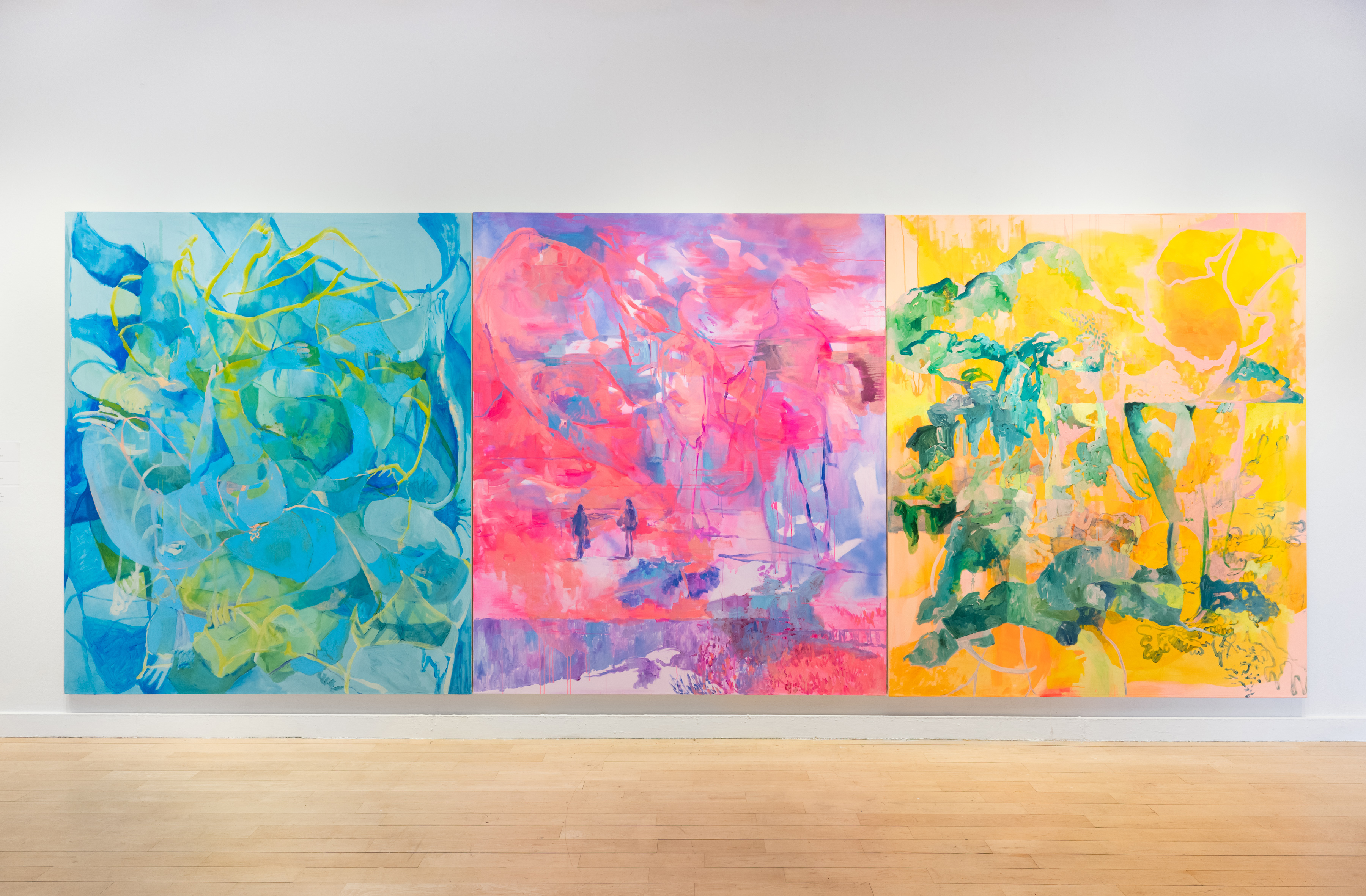
Katie Thompson Murphy, Some Inward Maze, 2025, acrylic on canvas, 84 x 72 inches, (left), Light and Languor, 2025, acrylic on canvas, 84 x 72 inches, (center), A Plunge at Daylight, 2025, acrylic and oil on canvas, 84 x 72 inches (right)
Wesley Roden: How can color reframe a subject in an unreal light? Alternatively, does color, especially saturated tones, lend to a subject feeling hypereal?
Katie Thompson Murphy: I love color. I love thinking about color, playing with color, staying with color. When I’m working with non-literal color, I use it as a way to “level the playing field”. It takes away some of the recognizable elements that a viewer may expect so that you’re left with something that must be explored because it hasn’t been seen before. In working monochromatically with these intense colors, there is a flattening of the image in resisting using color based on formal systems such as atmospheric perspective or symbolic representation. All of the lines and forms relate to and bleed into one another. There is a push and pull of tension and harmony. Tension in the readability of the image, harmony in the monochromatic color system, tension in the intensity of the hue, harmony in unity of the mark making.
Recently I’ve become enamored with synthetic fluorescent colors and have used them in my work as a way to signal a leaving of strict reality. These hues are available when working in acrylic. Luminous Red is gorgeous in its vibrancy, I love it undiluted. Shell Pink is powerful with its flattening opacity and I love it for the tension it provides alongside the intense neons. I like to use Luminous Lemon as an amplifier. These are not just colors but experiences I have become obsessed with. Fluorescents buzz! They vibrate off the painting surface and their energy is unmistakable. In Flaming and Apparent I used Holbein’s Luminous Red and Vermillion Red Flashe. In my studio I would go back and forth covering the surface with the intense fluorescent red and then responding with the flat Vermillion, addressing it more like a drawing through engaging in acts of addition and erasure. When working, I became fascinated with the intensity and how the darker matte areas helped a form to emerge. The acute memory I associate this painting with was one where I was realizing the solidity of my own power and bravery. The horizon line is positioned low and the layered figure takes up the entire canvas. This painting is especially difficult to photograph. The brightness of the reds cannot be captured by our at hand tech. It cannot be contained, which delights me. It must truly be experienced in person.
Fluorescents affect our humanity. They are brighter than bright. Daylight illuminates them in a way that synthetic light cannot. They both reflect and emit light. Fluorescent colors absorb light at one wavelength and then emit light at a longer wavelength. This idea of existing in a threshold experience, tied between the worlds of color systems and wavelengths, reveals a tension that is irresistible to me. A threshold experience is one that exists in between, after one has left a certain world or understanding and is about to embark into the new. The shifting shoreline between two entities. Using colors that exist between systems gives expression to ideas that cannot be firmly held, but are given space to form.
Fluorescents have also been historically recognized as having mystical and transcendent qualities They’re difficult to photograph and emit an ephemerality that alludes to the mystical and dreamlike. This contributes to the feeling of a ghostly image, one that can’t quite be solidly grasped. The revisited and layered images in my paintings feel like a dream you can only remember wisps of. Their resistance to comprehension relates to the fleeting nature of memory. The vibrant color is better experienced in person, although even I get lost in the intensity of the color when painting as I am working to find and define forms. At times I can’t tell where I am, I become disoriented within the canvas. As the figural images come forward and recede, resisting readability, the fluorescent colors also refuse adherence to one set of rules or expectations. This resistance to readability serves as disruption in the work, which continues to be a path towards new modes of thought. When familiar patterns of thought and comprehension can be disrupted, we see with fresh eyes.
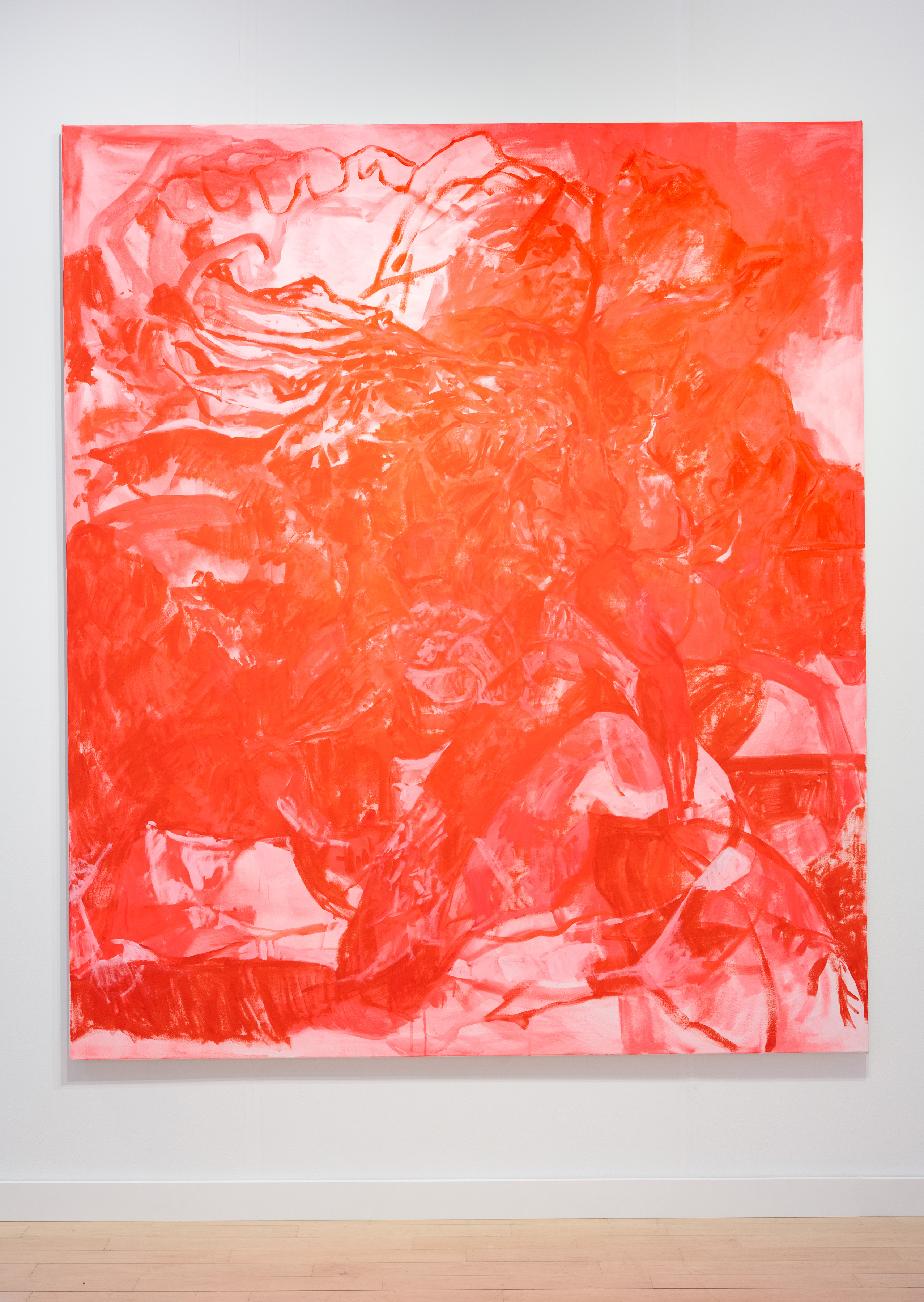
Katie Thompson Murphy, Flaming and Apparent, 2025, acrylic and flashe on canvas, 84 x 72 inches
WR: When painting, what steps are planned as opposed to improvised. Do you paint intuitively and do you follow rules or break rules?
KTM: My initial creative processes consist of taking photos and videos which I digitally collage. Using these personal images, full of meaning and memory, I apply filters to alter the color, and print the layered images out to use as reference for my paintings. Once I’m in my studio, I take the digital collages and hold them, tape them to the wall or tape them onto the painting surface to glance at while I work. These collages are my private evidence of how I have moved throughout the world and they become part of the assemblage of my studio, covered in fingerprints and moments of paint. I have an image of my sisters walking on the beach away from me. I use the same image in various scales on top of each other so there become multiple pairs of figures. I layer fragments of the image and shift the scale, making some parts larger than life and leaving others small. Then I might add an image of the native birds that were flying around us while we were there. These images have too many lines, too many forms. I start to lose where one image begins and the other one ends. It begins with disorientation. I start my paintings with these composite images and memories. An overload and abundance of information exists in the physical reference, which leaves me with myriad input to choose from. I find moments of mark making, texture or color that I am responding to and repeat them throughout the painting. This is my beginning, but eventually I come to a point where I release the printed image and work from memory and feeling. I work to remember my internal experiences and how my body felt as it moved when the photos were taken and I also work formally, responding to color, marks, and compositional balance.
So, I have a process that has emerged over time for me as a way that I am interested in working, but I’m not much interested in rules. I find certain constraints helpful and challenging, such as predetermining a color world to play in or staying with a certain size of surface, but overall I consider my practice an exploration not a dictation.
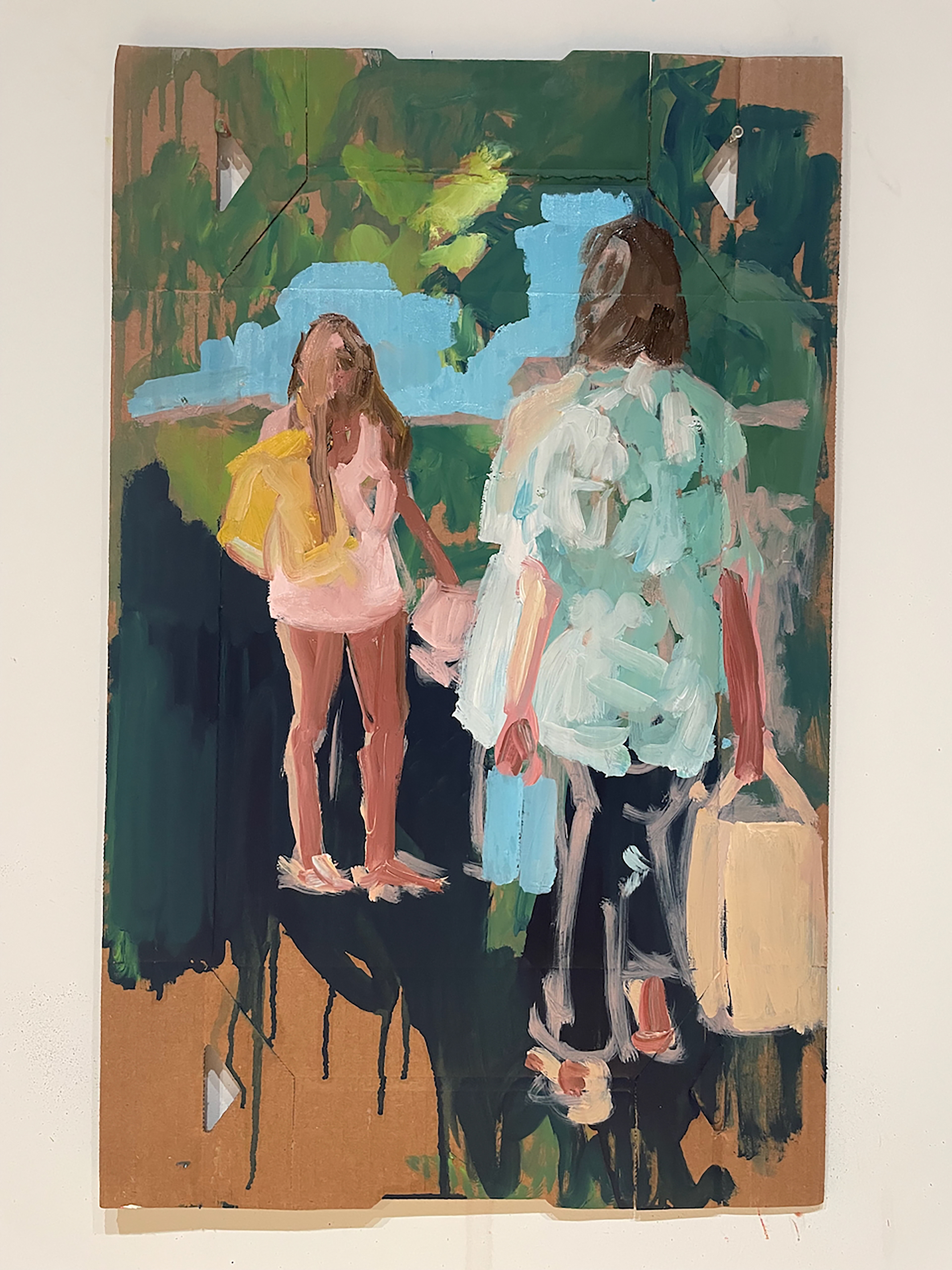
Katie Thompson Murphy, The Familiar Dust of Summer, 2024, oil on cardboard, 27 x 17 inches
WR: How does painting on cardboard as opposed to canvas lead to decisions that could only be made on one and not the other? Does considering wall space by incorporating wall paper into installations do something similar? Is breaking free of the canvas important for breaking free of other constraints?
KTM: For my works on cardboard, I was searching for a way to more literally embed my own life historical context into my work. My dad is a cardboard salesman and my grandfather owned a cardboard plant when he was alive and working. I grew up building the boxes that I am painting on in my kitchen as a little girl in Mississippi. So these boxes are specific and not neutral for me at all. My work can’t be fully separated from the life that I’ve led and in bringing cardboard in as a material to paint on, I was practicing bringing my expressive form of painting together with these containers that I’d grown up with. As a material, these waxed boxes are delicious to paint on, however. It’s such a soft substrate, it feels nice with the oil paint, which I think is an interesting thing to also think about as a painter; the sensuality of the act of painting itself.
The wallpaper used for “The Face Your Mother Drew” came from a similar exploration. That toile print is the same one that is in my own mother’s breakfast nook in her kitchen. I grew up looking at it, surrounded by French pastoral images that are common in Southern homes and refer to a colonial romanticization of agrarian life. The paintings that are situated on the wallpaper are full of movement, fluorescent red (a color that should never be found in the kitchen, according to Southern Living Magazine), and abstracted overlapping figures dancing. So the paintings are about being bigger, being too much, being more than what you’ve been offered to be.
These alternate materials weren’t about leaving the canvas for me, (I quite like painting on stretched canvas), they were ways to expand the specificity of my life context in and with my work.
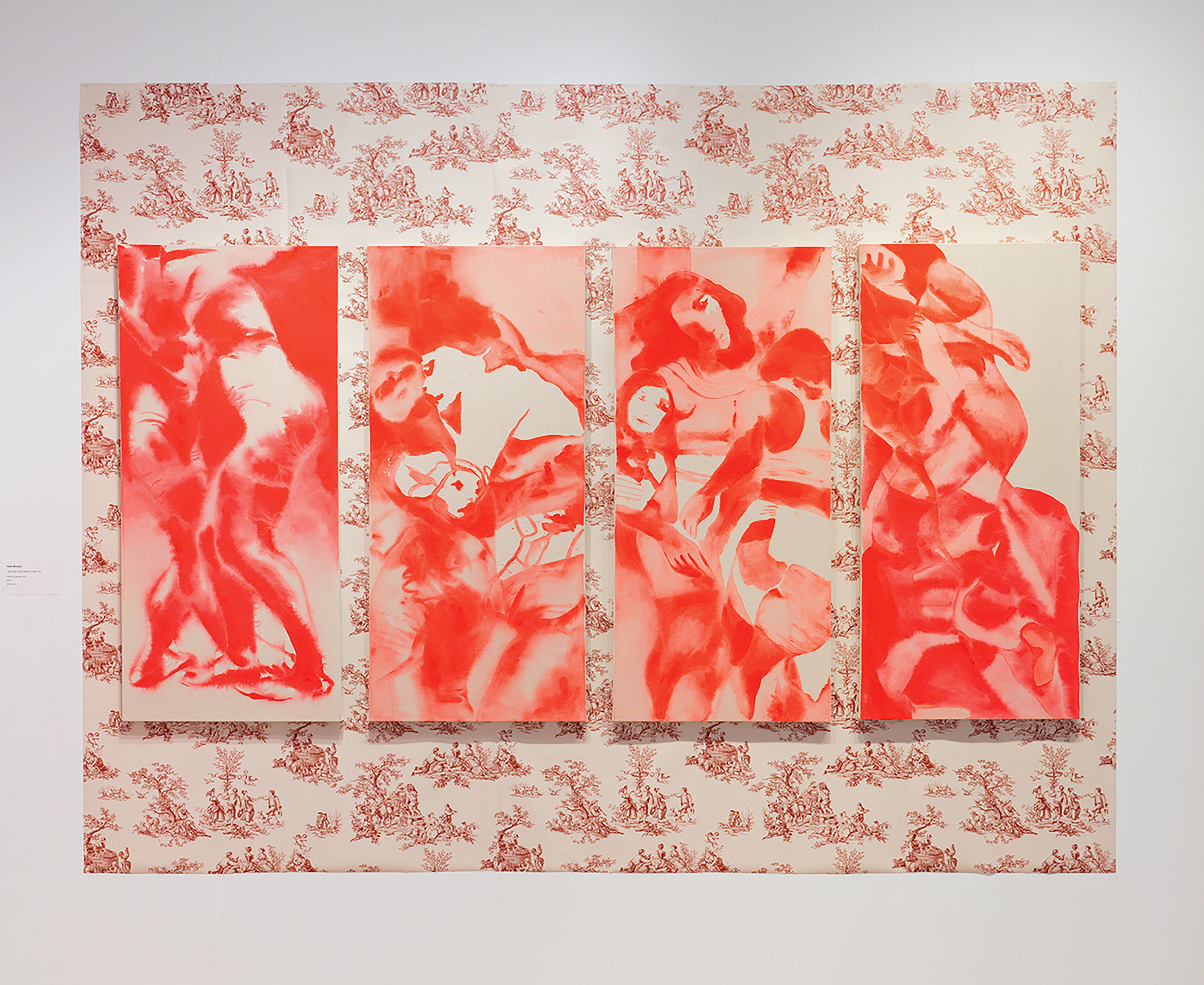
Katie Thompson Murphy, The Face Your Mother Drew, 2023, acrylic on raw canvas, 48 x 22 inches each
WR: I appreciate the range of scale between works. How does dimension and scale reframe the subject by, for example, making a work feel more bodily by mirroring the viewer’s own height. Has the shape or even the objectness of the canvas lent to the humanity of the figure?
KTM: The fluorescent work from 2025 is bigger than my body, but also exists in relation to my body. I can barely reach the tip of the top on my toes and when I spread my arms wide, the canvas is just barely beyond my fingertips. Engaging with the canvas on a scale that is physically overwhelming for me has shifted my orientation to the painting as an object as well as to the concept and reference images with which I begin. Instead of a practice of painting where I am working to achieve a predetermined end point, my practice has become an exercise in embodiment and discovery. I bring the relationships and memories that I am interested in exploring into my body, I hold them in my mind while I also represent them through mark making. I embody the work, though I am not always able to see or understand it fully. When I am making marks, I am so close to the paint surface that I cannot see the larger image and am forced to trust and also delight in how my hand works within my limited sight. My perception becomes immersed within the painting. When I move away from the painting and can see it in full, I am too far away to be able to alter it. I have to stare at it, consider it without being able to touch it. Perhaps I can remember the area I want to address when I return to the surface, but again, the way I experience the canvas when I am that close shifts how I interact with it and I may or may not accomplish my intention from moments ago. These moments of consideration, when I am distanced from the surface, lead me to new understanding when I see figures and landscapes overlapping. Physically engaging with my studio materials and embracing disorientation within image making serve as a method of discovery as I approach and retreat from the canvas. In altering my orientation to familiar forms and materials I am able to expand what I have known.
I have come to realize that it is the exhibitions that I have recently taken myself to in person, where I have stood before the artworks inhabiting shared space, that have had the strongest impact on me. The Baltimore Museum of Art held a retrospective of Joan Mitchell’s giant expressive abstractions in 2022. I visited the show multiple times to be able to stand before and experience these paintings. Her indulgence and skill with color stole my breath and drew me into the reality that she was offering. In the fall of 2023, I traveled to the Frist Museum in Nashville, TN twice to be able to experience the works included in Multiplicity: Blackness in Contemporary American Collage. I was immediately struck by the scale of the works included and the vibrancy in the colors. Scale matters. It communicates importance and immediacy. Having to alter my positionality to be able to comprehend a work is a beautiful practice, it is both supplication and desire. In the summer of 2024 I traveled to Hauser & Wirth New York to see an exhibition of Rita Ackerman’s paintings. When I entered the gallery I was struck by the space that was given to the large scale pieces and how they were enough, complete, in their quiet sanctuary. I was filled with conviction that paintings can fill the space and do the work required for leaving a lasting impression. Paintings can do it. They sang for me. It was the act of traveling to and standing before these works that solidified their influence upon me.
More recently I have been working on a smaller scale, works that are 5x7 or 6x8 panels and that I can hold in my hand. And I most often do hold these pieces in my hand when I am working on them. I think of them as hand mirrors or tiny windows. How does one relate to such a small little glimpse? It changes how I make marks, it changes my orientation to the painting surface. I cradle them, lean over them, bring them close to my face. My image making is a different experience, it’s very intimate.
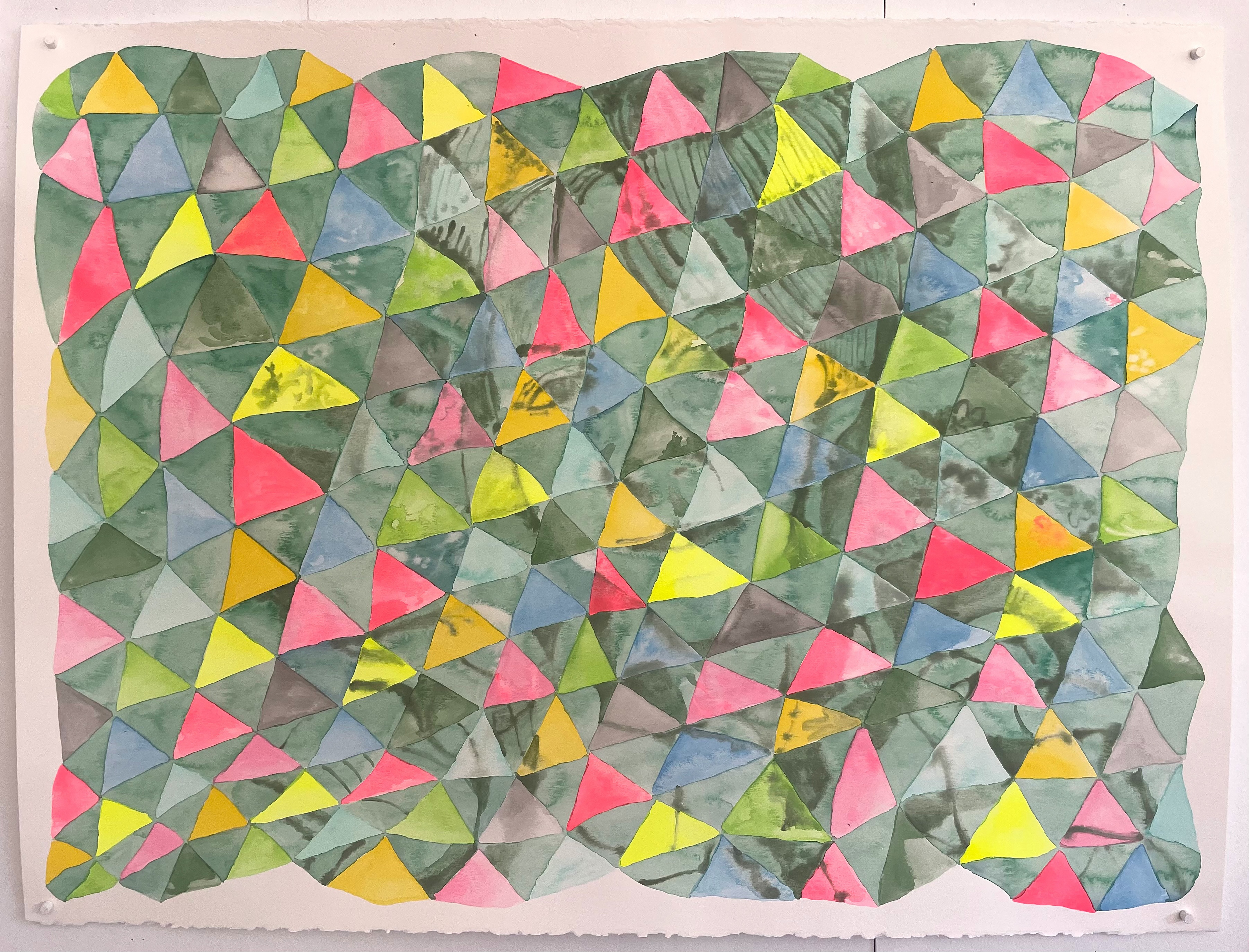
Katie Thompson Murphy, Dissolution, 2026, watercolor on paper, 22 x 30 inches
WR: What visual language do quilts lend, especially in regards to recent works? How does framing the figure within the quilt pattern draw comparisons between the body and the blankets that enshroud them.
KTM: The quilts, again, come from my family, my personal history. My great grandmothers were constantly working on quilts. My Granny Welsh hand pieced and hand quilted. My Grandma White liked the machine for quilting. I watched them when I was young, and grew up picnicking on, making forts with, and being wrapped within these beautiful and colorful art forms. Lately, I’ve been thinking about my love of color and pattern and how driven I am by getting colors that I physically respond to into my practice. The figure is always with me, always in my work somewhere - whether implied or literal. This past winter I had been doing these smaller watercolor paintings using patterns and colors found in quilts that I have or love, and the paintings hung out with me in my studio for a bit, but as I kept them near me I grew curious about layering them with figures. Layering and digital collage has been a part of my painting process for a while. It’s a way for me to expand an image, expand a memory, a way to give myself lots of visual information to play with and choose from when painting. So I added a figure on top of the pattern then played with the opacity until they became melded. But these watercolor paintings utilize a very different process than how I usually work. Working in oil or acrylic is ultimately very forgiving and you can correct mistakes. Working with watercolor on paper you’re forced to accept and work with whatever mark you inevitably make. But I love that too. When I painted these pieces I did develop a set of process “rules” for myself, I painted one triangle at a time but all while they were wet - so it was a one shot. I never revisited a triangle after it dried. There is a natural distortion that happens painting wet on wet that I am very interested in and the whole painting becomes a discovery process.
Conceptually for me, the figure and the pattern merge. The decoration becomes the person and vice versa. I think about our histories and what lies beneath our skin that makes us who we are. I like the blurry watermarks and the soft edges tucked within a structure of shapes. I wonder about the patterns that decorate our bodies, furniture, and walls and what we're trying to hide or promote with each of those choices. I think about the labor of the family who came before me and their lasting presence in these objects of comfort and beauty.
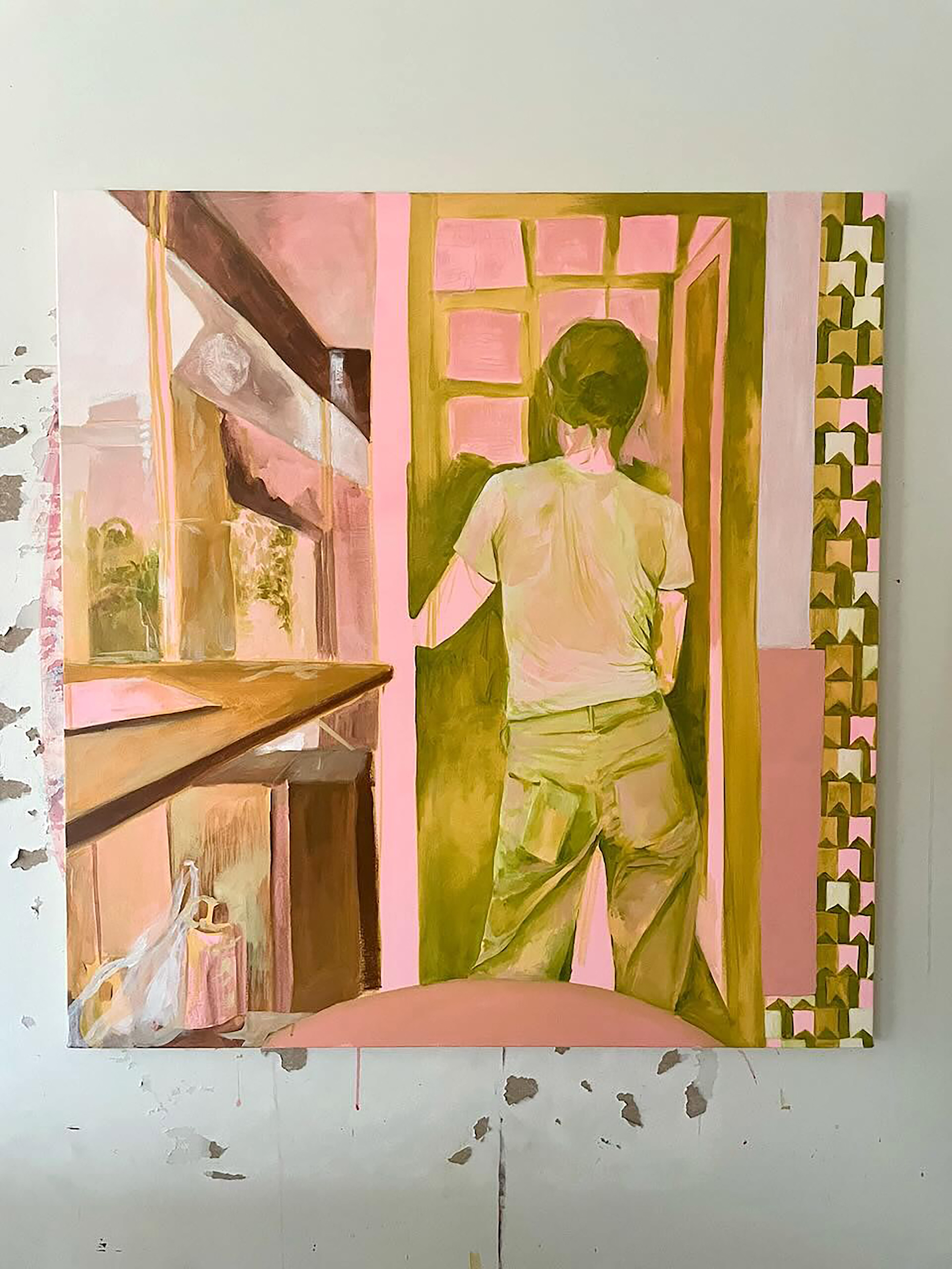
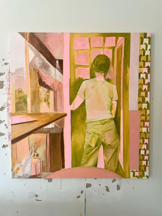
Katie Thompson Murphy, Sunday Brunch, 2026, acrylic on canvas, 42 x 44 inches
Katie Thompson Murphy holds an MFA in Studio Art from Maryland Institute College of Art and a BFA in Studio Art from East Tennessee State University. Murphy is a painter working with ideas that consider the intimate union between embodied movement and the puzzle of memory. With work rooted in location and personal relationship, she presents a colorful collision of figure, field, and feeling. She grew up in Mississippi where cultural norms and expectations had a profound impact on her and continue to provide avenues to questioning and rethinking contemporary personhood. She asks the question of what happens when we allow ourselves to expand. Murphy is an artist and educator and currently lives and works in Johnson City, TN.
Wesley Roden is the Program Associate at Tri-Star Arts and received a BFA in Painting from the University of Tennessee, Knoxville in 2023. Based in Knoxville, he currently works in digital and mixed media in a continually evolving practice.
* images courtesy of the artist