INTERVIEW: CARL E. MOORE
NOV. 18, 2025
INTERVIEW: CARL E. MOORE
NOV. 18, 2025
Rachel Bubis: You’ve been working in Tennessee for quite some time. How has your practice evolved over the years?
Carl E. Moore: I moved to Memphis to go to college, so I’ve actually lived in Tennessee longer than I lived in my hometown. So my practice has changed over a 40 span, all the way from college to now. When I started at MCA I was a realist painting using oils. After college, I took a 5 year hiatus to redefine my work and my process. I wanted to work in a way that wouldn’t feel restrictive but would allow me to explore any topic or subject matter. The work you see now is an ongoing evolution that is still evolving, I’m always trying to make a better painting.
RB: You’ve described your work as comparing social ideologies about race and stereotypes to “everyday colors” — how did this idea first take form for you?
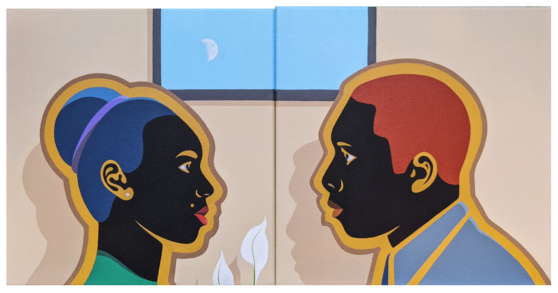
CEM: The best way to explain this is to identify the skin color in my work. I wanted to take a direct approach when talking about the black skin, the black person. I recognize that there are a lot of wonderful painters working today, who paint beautiful skin tones in radiant browns, siennas and burnt umbers etc. I’m more drawn to painting the black skin using black and grey tones, because it visually identifies with social and racial stereotypes of what I see as beautiful black people. This continues throughout my work because color acts as signifiers in our society. Black and white for race, red and blue now for politics, grey for urban, green for nature and so on. Gold has meant wealth and silver for purity. Painting the skin using black and grey tones allows all other colors to work around the main character in the composition, making him or her the main focus.

Carl E. Moore, Girl with Flowers 2, 2023-2025, acrylic on canvas, 48" x 48"
RB: Can you talk about your process of translating content or narrative into tonal value?
CEM: This is a little bit like color stereotyping on a color chart. Red is considered to be hot, active, and dangerous. Blue is calming, environmentally neutral, structurally masculine. Green is nature, indifferent, and stylish. I consider black, white, and grey as base or support colors. I use color to set the mood in my paintings, to give the viewer some kind of emotional connection. I sometimes use this in reverse to give the viewer an unexpected look into the narrative, such as using the color pink in the midst of conflict or painting flowers black to express mourning. Visually color activates the senses and in a painting, and it gives the viewer the information they need to know how they should possibly feel about the content. I try to do this in my work by combining certain elements like shape, scale, composition, and color.
RB: Over time you’ve mentioned pushing your palette toward a more “social color chart.” How do you decide when a color or combination communicates this?
CEM: I think good communication comes with using less colors. It’s like pre and post war propaganda posters which were more about clever color and composition. I want to be careful when I say reactive colors or action colors. Red, yellow, orange, green, black, and white can all be considered action colors when used together or with various type and background combinations. In light of our current social and political climate, I think clarity is important. My work is about expressing an idea or historical narrative in the most clear and concise way possible surrounded by my own personal statements. I think every artist has an internal color chart that they use to identify the way they work.

Carl E. Moore, Rowing the Mississippi, 2023, acrylic on canvas, 16" x 20"

Carl E. Moore, Passing Storm Over the Mississippi, 2023, acrylic on canvas, 16" x 20"
RB: How do you know when a painting feels complete?
CEM: I’m pretty organized when sketching out the composition for a painting. When all areas have been painted (even the corrections) and there are no brush strokes or blemishes in the color fields, then the painting is finished.
RB: Your work has a recognizable graphic quality — bold color, flat planes, and almost animated figures. What draws you to this visual language?
CEM: I like the bold shapes and good design. Clean colors, clean lines, complimentary colors, and well thought out compositions. I like images that are easy to read, conceptually simple but complex in their narrative. I think simplifying an idea or story can be just as difficult as developing something the traditional way. I’m drawn by different ways to develop a story through the power of painting.
RB: Does your background in graphic design inform how you approach painting and storytelling?
CEM: It does. I don’t think there is a difference between design and painting, I consider them both as art. Art and design are about relaying a message, expressing an idea. It doesn’t matter how you deliver that message, it’s still a visual experience. Painting, print, video, media all tell a story, it’s up to the viewer to decide how they see it or understand it. I think paintings carry a longer sustainable message than most media.

Carl E. Moore, To Teach a Man to Fish, 2023, acrylic on canvas, 16" x 20"
RB: How do you use photographs or visual references in your process?
CEM: I use photography as a form of visual correctness or reference. I think before you can develop something conceptually you have to have an accurate visual or mental reference of what it looks like. I sometimes create digital compositions before starting sketching the finished idea. Photographs are good for seeing how things occupy space, how light casts shadows at different times of the day. I also take photographs just as art.
RB: Many of your paintings draw from media-based events. Has your relationship to the media changed over time?
CEM: Although my relationship to the media hasn’t changed over time, the media itself has changed. The way we see it has changed, our exposure to the media has changed and the standards by which our society feeds it has changed. The way we can consume content now is endless. We don’t have to go find it anymore, it finds us. As an artist, it can almost be overwhelming.
RB: You’ve mentioned wanting to find a “subjective balance” in your work, avoiding reactionary responses. Can you talk more about how you navigate that tension between immediacy and reflection?
CEM: To clarify, I try not to create “Shock Art,” art that is meant to shock the viewer with something violent, strong disrespectful nudity, or something that could be considered as disturbing. I feel that people are exposed to this everyday all day in the news media or on the internet. So as a work of art, “Shock Art” can be viewed and quickly forgotten. A reactionary response. I do think that art can generate a social reaction, but more of an emotional internal response and even a call to action or reflection. Art that relays a strong message is art that expresses an idea from the past, present or possible future.

Carl E. Moore, The Travelers, 2025, acrylic on canvas, 36" x 36"

Carl E. Moore, I Voted, 2022-2023, acrylic on canvas, 48" x 48"
RB: In an era where everyone creates their own narrative, as you’ve said, what role do you think art plays in shaping or questioning those narratives?
CEM: Art should give the viewer something to think about. Art should ask questions or create visual images that allow the viewer to investigate all possible outcomes. Art can be a statement or propaganda, it depends on the intent of the artist or institution. Art by nature is a response to history’s past and/or present, it’s a form of documentation that is available to everyone.
RB: Have you ever been surprised by someone’s response to your work?
CEM: I like to hear feedback because everyone sees something different in my work. I don’t know if I’m surprised by someone’s response or what’s in the painting that reflects their response. I have had someone misinterpret what was taking place in a painting, but I think it was intentional to deflect from the actual subject matter.

Carl E. Moore, Protest and Fire, 2020, acrylic on canvas, 48" x 48"
RB: What kind of dialogue do you hope viewers walk away with after experiencing your paintings?
CEM: Whatever information they walk away with I think is personal. I hope they get the initial meaning of the artwork, but I can’t control that. I can only ask, did I do a good enough job telling the story I intended to tell, is the artwork successful in that aspect? But I do hope that they like the painting.
RB: What are you working on now and what’s next?
CEM: I’ll just end with, I’m working on a number of projects and paintings that I’ve been wanting to do for a long time but just never could get to.

Carl E. Moore, Phone Call, 2021, acrylic and gouache on canvas, 12" x 12"
Carl E. Moore is an artist living and working in Memphis, Tennessee. He received both his BFA and MFA from the Memphis College of Art. His honors include the Emmett O'Ryan Award for Artistic Inspiration, the Tennessee Artist Fellowship Award from the Center of Excellence for the Creative Arts, a 2025 Current Art Fund project grant, and the 2022 International Pinnacle Award from the International Festival & Events Association—Gold for Best Commemorative Poster Design for the Memphis in May International Festival Salute to Ghana.
Moore has exhibited in galleries and museums throughout Memphis and across the United States. He has curated and organized numerous exhibitions in small galleries, nonprofits, alternative spaces, and independent venues, as well as served as a juror for local and national exhibitions. His work is included in several private and public collections, including the Brooks Museum of Art, the Memphis International Airport, and the Tennessee State Museum.
Moore’s practice centers on events that unfold within social spaces and environments. His work explores culture and identity in everyday life, examining racial stereotypes and social beliefs through theme, shape, and color. By developing images that contribute to an ongoing dialogue about the human experience, he structures visual narratives that foster emotional connection with viewers.
Rachel Bubis is a Nashville-based independent arts writer, regular contributor to The Focus blog, and LocateArts.org Web Manager for Tri-Star Arts.