INTERVIEW: KATIE HARGRAVE
OCT. 01, 2024
INTERVIEW: KATIE HARGRAVE
OCT. 01, 2024
Rachel Bubis: Your work investigates how material culture provides a lens into the U.S. politics and environmental movements, both past and present, and describe how objects communicate layers of meaning:
“A flag communicates the flyer’s values; a tent communicates the user’s love of the outdoors; and a patch shows what organizations the wearer is a part of.”
What’s an object you would choose to represent you (your values or loves)?
Katie Hargrave: Perhaps this is a funny thing to say, but because I spend so much time analyzing objects and what they may mean, it is hard for me to imagine what I may authentically, unapologetically telegraph. Certainly the objects and symbols I choose to display have changed because of my studio research. I don’t know if I truly could list an object!
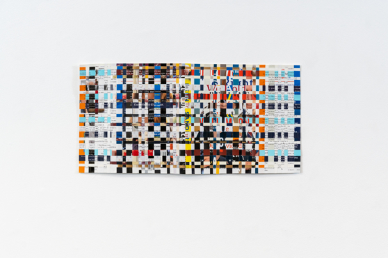
RB: You weave together the visual and written language of different political parties through works such as An Ideal Candidate (DEM, GOP) and My Time: Generative Adversarial Network Candidate Press. What insights did you gain through this combination process?
KH: There are very particular visual and written formulas at play in our political process. In terms of presidential candidate books, these patterns start to develop because of JFK’s Profiles in Courage, written just as he was catapulting to national recognition. Political figures have tried (and in my opinion mostly failed) to follow this formula for success. As far as the written formula, they almost all talk about their upbringing, where they’re from, their families. And there are party differences: if they’re GOP, they talk about their churches; if they’re DEM, they talk about any activism they’ve taken part in (maybe community organizing, maybe how they’ve supported unions). As far as the visual, it’s a little more subtle, but GOP tends to use navy, dark red, cream, and serif fonts. Democrat’s books are brighter, with more saturated colors and san serif fonts. Analyzing these books and reading them made me realize how little the actual words mean. And the way they’re found in the dustbin (I always found them in the sale bin at used bookstores, and many times signed copies that were given away) made me realize how little impact they actually have on the process for the vast majority of candidates. What a waste!
Developed Developing. 2023. Artwork completed with Meredith Laura Lynn. Photograph by Kelsie Conley.
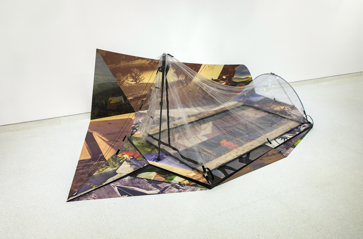
RB: In your work Developed, Developing, you examine depictions of the outdoors in national archives photographs, advertising campaigns for recreation gear, and tourist social media posts, noting they have uncanny similarities:
“Together, they represent a choreography of the outdoors, a nearly imperceptible and ongoing relationship between colonizing, capital, and experience. Advertisements make a claim that an experience of the outdoors can be authentic, but products disrupt the experience of the outdoors, by making it more comfortable but also by separating people from that experience.”
Again, can you talk about specific similarities you found in these depictions?
KH: This project is made with my collaborator Meredith Laura Lynn. We are both very fascinated by the early history of photography and how it relates to the establishment of so-called public lands (a part of the settler colonial project of making the western US palatable to development). In the photographs from early US Geological Survey expeditions during the 19th century, when people are present you see them setting up camp, staring off into the distance, etc. These same poses reappear in mid-20th century advertisements (I can think of one specifically for a company called Danner that sells hiking boots). We hypothesize that seeing these advertisements over and over when preparing to visit the outdoors results in similar poses in Instagram posts showing campsites and vistas.
RB: Have you noticed any departure from the way this language has been traditionally used in recent times? If so, can you name any examples?
KH: I am heartened by the ways that outdoor companies are trying to be more inclusive and forward thinking (ie Patagonia’s founder Yvon Chouinard giving his company to organizations fighting climate change, and REI providing seed funding to BIPOC owned brands) but we still see visuals that represent predominantly white, able bodied, straight sized people in the western US. My collaborator Meredith and I recently were visiting artists at REI and encouraged them to consider photo shoots in the swamps of the Southeast, for example. There are other ways of being in the outdoors than heading to the Rockies, Yosemite, or the Redwoods.
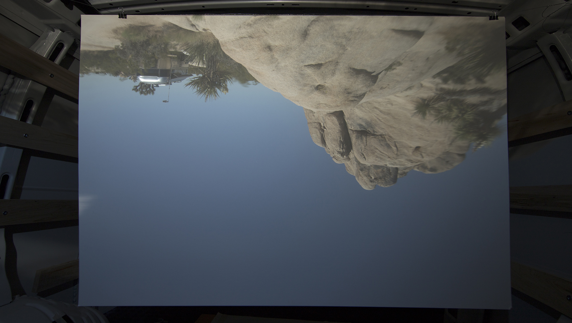
Camera Obscura (Joshua Tree). 2019. Artwork completed with Meredith Laura Lynn.
RB: Would you describe yourself as an “Outdoors Person” - do you go camping, etc.? I know in your work Camera Obscura (Joshua Tree, Rainbow Springs, Airstream), you converted a van and airstream into a camera obscura to create photographs. I’m curious if your exploration of this subject has informed your own experience of the outdoors? Do you think it’s possible or beneficial to engage with nature in a more “authentic way”?
KH: I am an outdoors person, yes, and I am certainly more aware of my place within the landscape because of the work I make. Most of my work that is about the outdoors is made with my collaborator, and the wonderful thing about collaborating with Meredith is that we process our experiences and our making together. Spending time in the landscape is a part of our process, and we unpack those experiences. I’ve been lucky to visit some stunning sites with her, and the research and process changes the way I experience other sites when I’m with my family or on my own.
The camera obscura work is interested in representing what we see from the car at campsites or at parking spots. I live fairly close to Great Smoky Mountains National Park whose claim to fame is that it is the most driven through national park, and the camera obscura work has really changed how I think about visitor experience in that park.
We expanded on the camera obscura work in Utah in a series of photographs taken at scenic overlooks at Canyonlands National Park. We made that work after reading Edward Abbey’s writing about the Utah landscape (he writes about Arches National Park, but his words influenced our work all over the state). He is very ableist and ageist in his writing, saying that the National Park should be for the young and strong who are able to hike far off the beaten path. Why is that? Why is that a more authentic experience? Who should be able to say what authenticity is to another person? I do think we can be more intentional and ethical visitors (for those of us who are visitors, this doesn’t apply to Indigenous people who are the rightful stewards of these lands). We should learn the histories of these places, we should stay on the trail to minimize our impact, and we should consider donating to indigenous, environmental, and scientific organizations when we visit.
RB: Flags are a theme in your work and serve a powerful example of how objects carry layered emotion and meaning. In A proposal for a flag for the Mississippi River, you re-imagine the river as a territory and create a flag incorporating maps of the area made by The US Corp of Engineers. Have you come across an existing flag that you love or think is particularly effective?
KH: I love flags but mostly because so many are poorly designed! The North American Vexillological Association suggests that good flags should be simple enough that a child could draw it from memory, and I love that as a criteria! My favorite new flag is the new Minnesota flag (the previous one was comically complex, I actually did a project where I asked kids to draw it and no one got close). I’d love to revisit that now since the new flag is so elegant and simple (a star representing the North Star, a blue field that is an abstraction of the shape of the state, and an aqua area representing all the water in the state).
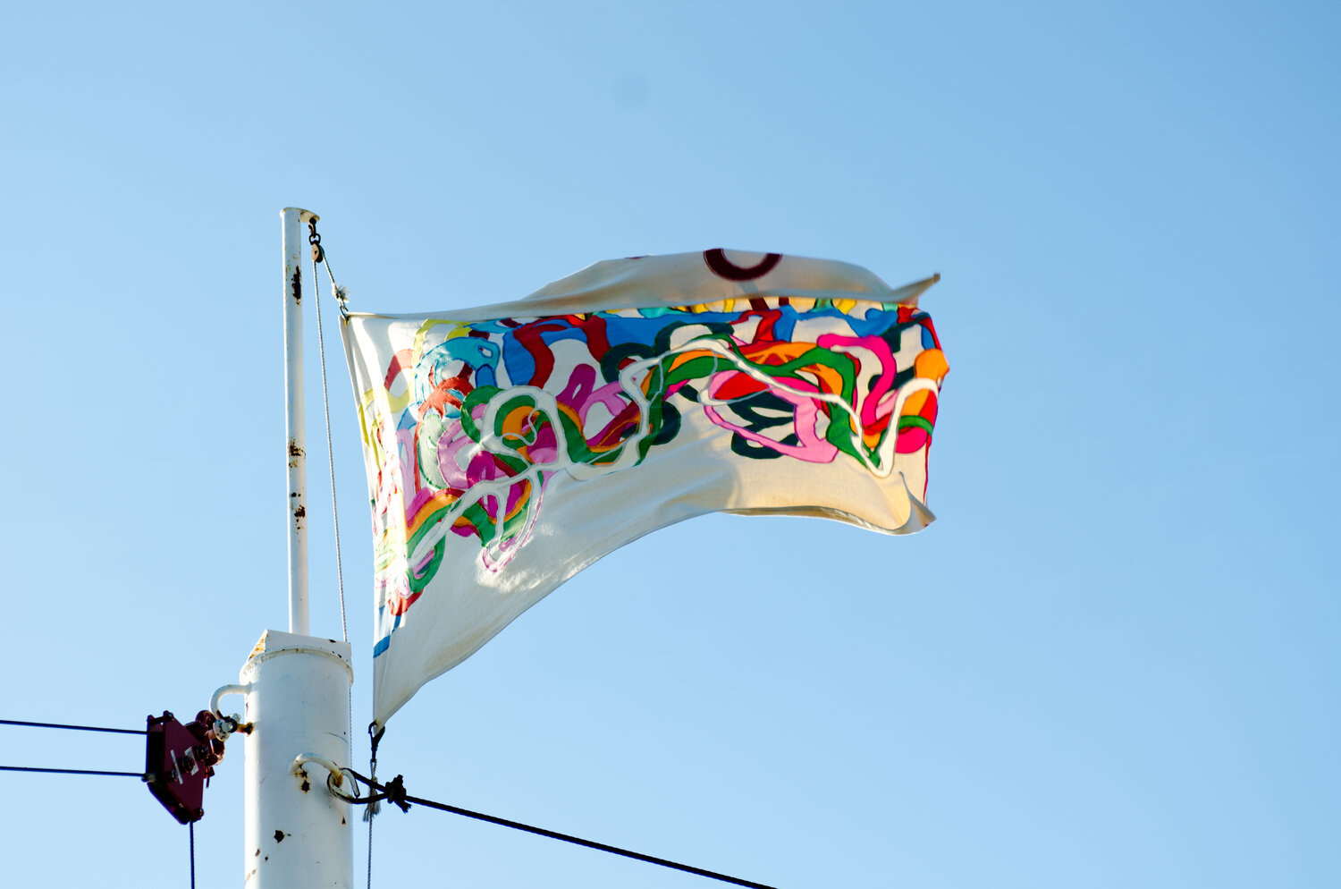
A proposal for a flag of the Mississippi River. 2012.
RB: You use a wide range of materials – at what point in your process do you choose them for a specific work? Do you collect materials that inspire you for future use? Where do you source them from?
KH: I have always used a wide variety of materials in my work because I was lucky to have educators in my college experience at University of Illinois that focused on the conceptual rigor of the work (shout out to Melissa Pokorny and Conrad Bakker, amongst others) as well as the formal qualities. I was a painting major but never made paintings after my sophomore year, and instead made installations, performances, and videos.
Collaboration has always been a part of my artistic practice, and some of the things that collaboration forces is good communication, slowing down, and being flexible to other people’s suggestions. This leads me to slow down in thinking about materials, so ideas usually come before form. For the last 10+ years I have been really drawn to fibers throughout the majority of my work (and almost all of my work with my current collaborator Meredith Laura Lynn), but even still the ideas need to be right for the specific materials to come to the foreground. We’re lucky to have exhibition partners who trust this process when inviting us to make work for new exhibitions, but I think the slowness pays off.
I do collect tons of stuff, and if I ever need to move studios I will be in trouble! My current favorite art supply store is a used outdoor gear store in Chattanooga called the Gear Closet (they support water quality efforts with the purchase from their store, which makes it even cooler).
RB: Have you ever been surprised by someone’s response to your work?
KH: Someone told me once my work was for third graders and retirees, which really made me laugh. I’m such a nerd that I will definitely take that as a compliment!
RB: What are you working on now and what’s next?
KH: Meredith and I are working on a multi-year project called “Bad Outdoorsmen” that is a fangirl version of the History Channel reality TV show Alone. The project is a mashup of the TV show with 18th and 19th century outdoorsmen who were both problematic and really bad at being outdoors despite being lauded in popular American narratives of conservation (such as John Muir who was not only super racist but constantly wrote in his journal about being annoyed by bugs). We have applied to be on the show and have made an application video and are working on several video installations which we are calling “episodes.” The first will open this fall, and we are in the final push to get them all ready to debut.
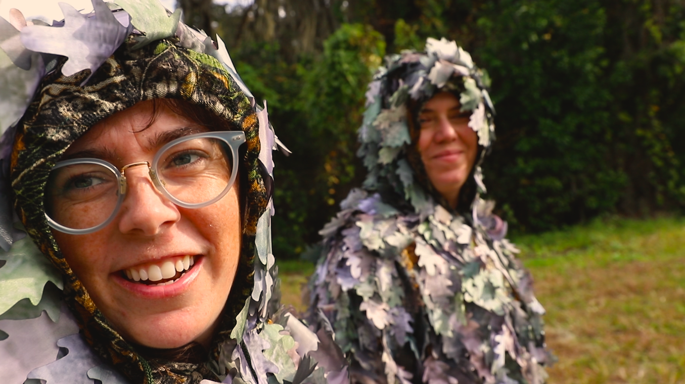
Bad Outdoorsmen. 2024. Video still of video made with Meredith Laura Lynn.
Katie Hargrave (b. 1985 Chicago, resides Chattanooga, TN) is interested in the production of American identity through politics, history, mythology, and narrative. Her work elevates stories from popular culture, those hidden in the archives, and the everyday conversations from passerby’s and participants. Hargrave is a professor of art at the University of Tennessee Chattanooga. She received her MFA in Intermedia and Drawing from the University of Iowa, MA from Brandeis University, and BFA from the University of Illinois. Her work has been shown at Proof Gallery in Boston; Gallerie Analix in Geneva, Switzerland; the Manifesta Biennial in Murcia, Spain; The Philadelphia Art Alliance, and the Athens Institute of Contemporary Art, to name a few.
Rachel Bubis is a Nashville-based independent arts writer, regular contributor to The Focus blog, and LocateArts.org Web Manager for Tri-Star Arts.
* images courtesy of the artist