INTERVIEW: DONALD KEEFE
JAN. 17, 2024
INTERVIEW: DONALD KEEFE
JAN. 17, 2024
Wesley Roden: Whether landing gear amidst an excavation site or classical sculpture lingering in a basement, your work turns recognizable objects foreign by altering the environment. Do you see your role as an artist as being that of reframing cultural symbols? How does depicting some objects as if naturally existing and others as if collaged in place, comment on their recontextualization?
Donald Keefe: I’m interested in anachronisms. We very much experience the world in a broken up, jumbled way. We can be sitting on a hilltop watching a sunset, with our field of view fractured by a window on our screen, which is further fractured by additional tabs of windows. I think many cultural symbols are already reframed in so many ways… we’re all just trying to make sense of it all. Trying to place them as if in a cohesive environment, or emphasizing their collage quality speaks to that effort. The particular work you referenced with the landing gear, is titled Stela. I made a few works referencing the story of Icarus indirectly, as a memorial to hubris and failure. Another is The Great Physician. The hubris can be in the act of redefining symbols — or the hubris to resist their redefinition. In Stela I intentionally went with a form that not only represents flight (and the implied failure thereof), but is also a very masculine form. I think this was the second or third painting I made after getting married. It, Harbor, and Out-of-work Horse were addressing roles expected of men in marriage, and how my situation at the time had made it difficult to fulfill those expectations.

Donald Keefe, Manifest Destiny, 2021, oil on canvas over panel, 40" x 41" x 2"

Donald Keefe, Stela, 2015, oil on canvas, 16" x 20"
WR: Some works, namely those in the Babel series, can be read as warnings. By reinterpreting the Biblical narrative through something as unassuming as Jenga blocks, does the work assert levity, sincerity, or a combination of both as a way of heeding art historical lessons?
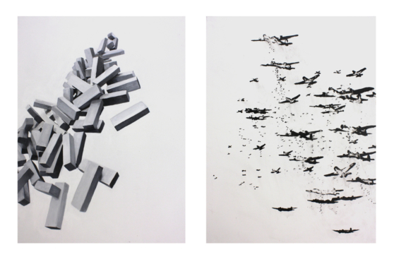
DK: These works were sort of a reaction to going through the recession. I had been doing a lot of non-representational work for a while up to that point, and wanted to make something that used representation to say something about the events of the time. I was inspired by the lore of Philip Guston, who, after quitting AbEx and looking for inspiration, turned to drawing a simple lightbulb. I wanted to start with something simple: Grisaille, simple, repeated shapes, etc. The Jenga game seemed like a fitting analogy to the economy teetering and being weakened from the bottom up, and the shapes kinda reflected bar graphs, piles of bricks, coffins — and of course the game itself. There is also a bit of David Caspar Friedrich’s The Wreck of Hope (also called Sea of Ice — but for my purposes I prefer the other title) seen in the toppled forms.
I wouldn’t say the work was about levity. Being black and white adds a certain grim visual weight to it. I did do a couple works that were color and had other building blocks like Lincoln logs, etc, but it went into a direction of nostalgia for childhood that I wasn’t interested in pursuing. I have one of these on my website, simply labeled as “Untitled.”

Donald Keefe, Untitled Calamity #4, 2011, acrylic on canvas, 40” x 63"
WR: Much of the Perseverance series can be read as the aftermath of some cataclysmic event. Does the work hint at narrative, provide some greater explanation as to what happened, or simply meditate on decay?
DK: I was definitely thinking of (the 18th Century art movement) Romanticism, especially buildings that were made to look as if they were old and partially ruined, as a sort of place to meditate upon hubris and the equalizing fate of all things.
I had some personal loss at the time of making these. My mother passed away… I’d already lost my father years before, and my grandparents passed at this time too. I started getting word of friends I grew up with passing away… black seemed appropriate (as well as) empty stage like spaces, devoid of people, waiting for actors to step on to the stage.
I also was an Artist-In-Residence at the Contemporary Arts Center in Tory, NY at an early stage of this series. I had already started doing work based on abandoned factories in Eastern Kentucky, but my time in upstate New York really allowed me an opportunity to explore the ‘rust belt,’ including a trip up to the Adirondacks to see and explore some vast abandoned, burned down, and dilapidated factory complexes. Several of these works emerged from this experience. I prefer not to be too literal with the personal in my work, but in a weird way, these buildings became a stand in for self.
I was also interested in the idea of drawing on canvas. Several of these works were essentially that with little use of paint, and mostly graphite and charcoal. Drawing on canvas is usually a preliminary step, but I wanted to be somewhere between drawing and painting as an artist, and also to say something about the unfolding and continued nature of decay. Everything is decaying all the time.
WR: The Perseverance series features obscured, gray scenes that could exist anywhere between nuclear fallout and the boiler room downstairs. Can you elaborate on how the greyscale afforded by graphite contributes to this ambiguity?
DK: Certainly. Color would contextualize them too much. As the series progressed they became increasingly high contrast as well. I’m really interested in light and dark as both an abstracted compositional element, and also a conceptual-spiritual idea: i.e. “The light shines in the darkness, and the darkness did not comprehend it.” John 1:5. Again referencing Romanticism — light was often used in landscape paintings as a symbol of divine presence. I didn’t make a similar connection to the color yellow though, like (the painter) Gauguin. While saturated color would be ‘too exciting’ for this series, there are subtle colors. Before working over the canvas in grays, the whole canvas is worked over in washes of color acrylic paint, which pops out in a few places here and there.

Donald Keefe, Ruins of Troy, 2016, oil, charcoal, graphite on canvas, 47” x 45”
WR: By painting the decay of both objects and the cultures they represent amidst seemingly eternal landscapes, do you confront what is either fleeting or lasting in your own crafted images?
DK: As the series progressed, and the interest became more focused on these extreme contrasts, what ultimately lasts is the light and dark — whether day and night, or light and dark in a spiritual sense. Since most of these are interior spaces, one would hope that the light outside is the more lasting factor… it's just shining through the cracks in the various structures we hide in. I’m beginning to go into a Plato’s cave scenario I suppose. Light ultimately represents hope in these — that there is something beyond failure.
Several works are on unstretched raw canvas. Those hang from a bar at the top, like a scroll. As a viewer passes by, or the door to the gallery opens, they move some from the wind. They’re also decaying literally. Every time they’re unrolled, hung, rolled up again, more and more charcoal, graphite and cotton canvas detritus comes off. They’re slowly changing over time. So there is a fragility emphasized materially as well.
WR: Your artist statement describes painting as a window, mirror, and object. In the Ambispection series, how does the inclusion of paint swaths, pencil lines, and digital distortion, which hint at the painting being an illusory depiction, either bolster or downplay one or all of those three functions?
DK: The ‘window, wall, and mirror’ terms are from Mark Tansey’s History of Modernist Painting series. I’ve always enjoyed his work for its execution, width and depth, as well as how it uses the language of art history to say something about art history.
Something that was instilled in me by one of my professors, the late artist Arnold Mesches, is that an artwork should be interesting as a work of art first — then maybe a viewer will be interested in whatever specific thing the work is saying. I’ve thought a lot about that over the years.
As an artist, in addition to communicating something about the immediate subject, I’m also in dialogue with the history of painting and drawing. Part of that is revealing the process. For the parts that reference a digital process… that's part of revealing more of the process. We don’t live with a nineteenth century field of vision anymore… nor do we work that way: I mean — I laugh a little when I see students making landscape paintings from their phone screens. Admittedly, it is hard for me to leave processes exposed because I tend to fuss over things until it’s probably overworked and static. I’ve always enjoyed the craft of illusionary painting — that is, representational artwork with perspective and modeling that is finely executed. This is the window. Paint swatches (as in Dead Horse Point Perspective), textural areas built up from the remnants of my palette (as in Somewhere, Not Here), and the openness of pencil marks (as in The Great Physician), emphasize the flatness of the surface, negating the illusion of the ‘window.’ Any sort of ‘unfinished’ quality will push the viewer out of the picture to the surface of the support. Initially, working in drawing and grisaille (in reference to the ‘dead layer’ in underpainting) on canvas was also part of this ‘unfinished’ quality but it became its own thing. I conceive of the mirror as something like what Harold Rosenberg described as the ‘arena’ in which the artist recreates a mental state. The ‘painting’ is just the artifact of an action that took place within the ‘arena’. There is also the interpretation of the mirror as something like a Rauschenberg ‘bed-on-the wall’ work… though with relation to my works, I think Rosenberg’s view is more appropriate. The inclusion of spontaneous ‘action’ marks (a ‘Dionysian frenzy’ as Gombrich characterized Pollock’s) is actually the most difficult for me. Perhaps it's self-defeating and contradictory, but ‘planning’ and executing spontaneous marks as part of a mostly pre-conceived composition is a bit nerve-racking. I want the viewer to interpret them as spontaneous, irreverent, and desperate gestures of the author/artist to a certain degree, but they’re actually planned quite a bit (as with the Post-Antiquities diptych). These can sometimes become that special ‘je ne sais quoi’ of the work. Admittedly, this is something I am working on further — or rather learning to let go of my desire to refine things until they are static.

Donald Keefe, Dead Horse Point Perspective, 2022, oil on canvas over panel, 40" x 32"
WR: You use the word “ambispection” to describe a way of creation that is reduced neither to pure academic art making, nor art for art’s sake. Does the integration of each mode of artmaking ever change and does that change result either from involuntary reaction or deliberate practice?
DK: ‘Ambispective’ is a term used in medical research that basically says that future outcomes can reasonably be expected based on past observations.
I have many students who are also interested in psychology. They use the terms introvert and extrovert a lot, and of course we’re all aware of introspection. I don’t know if there is something called extrospection (I guess it’d be observation?), but in the personality tests I’m literary 51/49 introvert and extrovert, so I wanted to find a succinct word or phrase that kinda expresses that, and how I think about my artwork. I’m not really big on reveling in art making as self-therapy (I’m not sure how sustainable that would be as a motivation for practice), however I aim to have more depth than a pure academician. I do enjoy just making — ‘art for art's sake’ if you want to call it that — as a pure means of creation or “Disinterested” as Kant would call it — and I try to have all my work at least start from that point: non-representation compositional doodles just exploring balance and movement and shapes within a frame. I have sketchbooks full of such doodles. I have my students do them too — not sure how many see the depth to such exercises beyond just what appears to be scribbles in a frame — but hopefully more than a few. These often become the skeletons upon which I develop each work — it’s just a matter of defining the marks.
WR: You have distinguished that while representational art may capture the physical, abstract art may capture the spiritual. With this in mind, how does your integration of abstract patterns into representational images merge or distinguish the spiritual and the tangible? How does your reading of the landscape as divine play into this?
DK: I love artworks by Thomas Cole, Albert Beirstadt, Caspar David Freidrich, etc. Cole’s Course of Empire. Beirstadt’s use of luminosity and scale. Freidrich’s altar pieces that make the landscape the primary element. The use of landscape as a means of communicating a spiritual idea came out of the Protestant Reformation. Since it’s established as a means of communicating these ideas, I’d rather co-opt it than redefine it. Rothko of course referenced Friedrich’s Monk by the Sea.
I am also interested in Kandinsky and others conceived as the artist as prophet — though less so in the performative-theosophic aspect of his claim. Newman tried so hard to define his works in spiritual terms (using titles like “Onement,” and “Sublime”), against a wave of formalist interpretations.
I use the patterns as a unifying element. I tend to favor busy compositions, so the pattern is a regular, repeated form that kinda holds it together. In reference to a previous question, symbols are defined and redefined so frequently now, that we all form and hold some system of belief to organize and hold it all together. We have to come up with some system that reconciles our own double-mindedness in some way — or else we’d all go mad. I feel the pattern kinda does that in the artwork. It's a new element for me, but even just using stripes functions in the same way. A regular form that passes behind, through, and over the various elements to hold it all together. I’m so obsessive over these types of things, I use a level to make them — so I guess that does speak to my own desire for order amidst my own creative disunity.
, 2022, oil, acrylic, paper on canvas over panel, 24” x 20” per panel")
Donald Keefe, Post-Antiquities (Diptych), 2022, oil, acrylic, paper on canvas over panel, 24” x 20” per panel
WR: Your Untitled Construct paintings could be seen as either abstract or representational for how they depict abstract forms in real space. To what extent are these works imagined as opposed to referencing actual models, and by attributing realism to invented objects, does the work question the distinction between the literal and the abstract?
DK: For these works I actually made some simple wood and wire sculptures during quick breaks between the classes I teach. At the same time I was having students do some paintings of cardboard boxes, lit with colored lightbulbs as an exercise on how colored light affects objects of the same local color. When the semester ended I took the sculptures I made, and lit them out of curiosity. I took a bunch of photo references, did some digital editing, and that became the basis for the works. I very much liked how they were sitting on the fence between abstraction and realism. Some I painted more directly from life with their cast shadow and all (Untitled Construct 1 & 3). In others I completely removed references to their context, and somewhere in between. I’ve thought about exhibiting the sculptures with the paintings at some point, but it hasn’t happened yet… and I may give too much away to the viewer… I’d hate to make people ask the kinds of questions you’re asking here. Since I do value representation and abstraction, these are questioning how we place those hierarchically. I’ve already said earlier that I enjoy the effort put into modeling a rendered form, so here it is interesting because all that effort goes into the work to obfuscate it, rather than define and clarify it.

Donald Keefe, Untitled Construct 6, 2018, oil on canvas, 29" x 25"
WR: You allude to inspirations ranging from podcasts to landscape. Do you draw connections from sources that only you would have the background to interpret or do you see your work as a way of introducing new concepts to viewers? How much, if not all, is determined simply by fascination?
DK: This is one area where I just can’t fully embrace art for arts sake — or the purity of the medium — or whatever. So many of my ideas are rooted in things outside of the painting itself. At the same time, I’m not an illustrator. It is a balancing act. Giving some info in a roundabout attempt at being poetic, without being too “on the nose.” I am a person of faith, but if I wanted to be purely Evangelical about things, and show the utmost desire for a viewer to ‘get the message,’ I’d write or illustrate a book.
Content wise, I pull a lot from my travel photography, architecture, art history, and still life. Concept wise (beyond painting itself.) Probably the biggest influence is Will & Ariel Durant’s The Story of Civilization. I have the audio books of the whole set, and I’ve listened to them several times over while working in the studio. Of course, the last volume of that was written in 1975, so not exactly contemporary, but the scope of the writings are appreciated. Also Gombrich’s The History of the Art (and many of his other writings about art like Meditations on a Hobby Horse), Wölfflin’s Principles of Art History. Some fiction like Rabelais’ Gargantua and Pantagruel. Mythology and classics like (the works of) Ovid. The Bible is a big influence.
I guess in some ways I’m more in dialogue with these authors and sources, than with a specific audience (maybe that's my problem too). Maybe because I’ve moved a lot in life… midwest, west coast, east coast, south… I’ve kind of curated my own audience of friends scattered about and long dead and forgotten authors. Not the best way to be ‘relevant,’ I suppose, but, more and more, I’m accepting it. Again — we use systems to reconcile our own double-mindedness, otherwise we’d not get out of the house everyday. I make ‘contemporary art' for people I’ll probably never see again or meet in person.
I guess it’d be neat to introduce some of the specific references in my work to viewers in some way… but as I said earlier, they have to engage with the artwork as a work of art first. If they can care enough about it on that level, then maybe — just maybe — they’ll care to know more. Those conversations are rare, but enjoyable… and I’ve accepted that. Most people like them as artworks, and the meaning is mysterious, but seems interesting. Maybe in time I’ll pair down the visuals and be more direct, but I tend to start an idea at a literal point and abstract from that… so we’ll see.
I also revisit a lot of my 90’s and early 2000s obscure musicians playlists, though most of what I listen to now — if not Jazz — is Soul and R&B music from the 60s and 70s. TED talks on various subjects, etc. Music tends to influence my mark making, so I try to be aware of that, and that's why I prefer audio books, etc. It sort of slows me down mentally. That said, I am a musician too, and do like to groove with a bass guitar in my hands.
WR: Apart from painting, you also have created drawings, monotypes, and a range of mixed-media. Does the durability, tactile quality, and replicability of one medium, for example, print-making, influence themes in other mediums, such as painting? Do ideas incubate in one medium before transferring to another?
DK: Drawing is the most immediate and open. My mixed media collages and monotypes I also consider fairly immediate. For ideas for painting, I’m more and more finding monotypes as a very useful way of working through ideas and generating composition. These, and collage, have certain limitations that spur more creativity. A software based approach can offer too many possibilities sometimes. There is an unpredictable quality that is needed but is hard to get with something other than physical, tactile media.
Painting can become very static. It’s something I wrestle with. Drawing and my monotypes layer in a certain way that the work just doesn’t become solidified in the same way — or not as quickly. I am learning to incorporate more of that openness into the paintings.
You can see this in Somewhere, Not Here. The composition for this painting was developed from the monoprint “Double Minded.”
As mentioned in reply to an earlier question, I do a lot of just nonrepresentational doodles, just working out composition with line, contrast and movement. These are very open, and I can later ‘define’ these marks as forms, which become my paintings. Here is an example of that with Mythos.

Donald Keefe, Mythos, 2020, oil on canvas over panel, 40" x 32"
DK: I also have some three-dimension works I'm tinkering with. Well — three dimensional, but intended to be viewed from the front like a painting. I’m getting to them when I can. I’m very interested in where they’re going. Basically taking abandoned paintings and creating objects with them. So things all kinda feed each other. Here is one:

Donald Keefe, wall sculpture in-progress, 2024
WR: How has painting and drawing friends, family, and animals impacted or remained separate from your conceptually driven investigations? How essential to your practice is the appreciation of environment and community made possible through representational work?
DK: Some of those were commissions, others gifts. Some are exercises. An oil portrait, even if not exact in proportion and modeling, dignifies the subject in a way a photo doesn’t.
My many self-portraits are useful artistically to keep my observation skills up, but they also function as a kind of snapshot for who I am at that time.
Family portraits are something I’ve been getting more into. Having kids has made life more meaningful (and busy!). I also do some quick drawing, caricature type stuff. I don’t have any to show, but sometimes I do that at events to make a few dollars, but it also forces me to work fast. I’ll use graphite or charcoal sticks for those. A few of them are part of my broader series of works. Waiting for example, was created based on reference material from an abandoned, decaying factory I wandered through while doing the artist residency in upstate New York.
The portrait of George Spears, the father of a good friend, commemorates his quirky ways and a space that no longer exists because it was taken through eminent domain. I’d stay at their house near every weekend during my first year of undergraduate. So there is an appreciation of people there.
I started college as an anthropology major and art minor, then moved to architecture (which my family really wanted me to do), before moving into art (which is what I had wanted to do all along). So a consideration of people and environment are part of me. I still use many of the tools and things I learned in architectural drafting. Perhaps by environment, you mean the landscape references? Funny thing is that I hadn’t really done much landscape work before this series. I grew up out west, and really miss the landscape there. Large, dry mountains, vistas that you can see forever from, etc. As a kid, the scale of the landscape evoked what I later learned was the sublime. I received a grant to travel and do some artwork based on national parks, and I wanted to revisit the region I had such fond memories of. Of course, that body of work grew conceptually to become what it is now. The landscape was in many ways a vehicle to say something else… I guess I’m going back to the Plato's cave thing a bit.
As far as environmental concerns… of course I have concerns as we all do. However, I’m not really pursuing that discourse in these particular works. I guess I’m more of a romantic in that way… the landscape references I often choose interest me because they evoke the sublime.
WR: Since Ambispection deals with perception in regards to truth-seeking, has not only receiving but also sharing knowledge impacted your practice? How has your role instructing upcoming artists informed your work’s notion of self and others in relation to perception?
DK: I teach observational, gesture and figure drawing, some mixed media drawing, indirect and direct painting approaches, abstraction, and a little bit of sculpture too. The range of curriculum I teach definitely influences my work… Teaching also gives me ideas for artwork. Sometimes I’m inspired by the students. I hope I inspire them in turn.
I also think working with students in their late teens and early twenties has pushed more towards embracing formalism. A lot of students are very interested in the psychology behind their work, and use their creativity as a means to work through depression, trauma, angst, rebelliousness, etc.
Maybe it’s something that comes with age, but at a certain point I realized that making work that reinforces unhealthy emotional states and has the artist continually relieving their hurts, maybe isn’t the healthiest of approaches. I recognize that creatives tend to be more ‘feeling’ types than others. However, if the only source of creative inspiration is working from a place of pain, it could lead to a cycle of recreating or reliving trauma in one's life to feed that creativity. It’s like how it is easier to write against something then for something. I think this is why a lot of creatives are ‘tortured souls,’ — they need that torture because they have nothing better to motivate them.
Eventually we all sort of settle into who we are. At which point, what source of inspiration will we have? I think looking outside of self, or diving into the history and discipline of the medium more, is a source. I teach at a faith-based school, so we hopefully impart something of that to students in helping them build a durable source of motivation that can sustain them over a lifetime. I feel this is especially relevant with depression and mental death crises amongst young people being so high.
We all have the power to change our own story. I think this can even be seen in the development of my artwork over the years. The gray, ashy, black and white work was from a time of uncertainty. When I had kids, I think I was influenced by all the colorful toys we accumulated around the house, so my artwork became colorful again. Teaching has made me consider the formal qualities of art and art history much more. A lot of people really liked the black and white works… but I’ve worked through that and I’m now onto something else. Those older works didn’t offer much hope in their grays. The newer works, at least through their use of color and variety of elements, speak more to life — even if they are still usually devoid of living people. Ultimately, faith in something greater than oneself, belief in one’s own resiliency, a hope for tomorrow, and an appreciation for the life we have — warts and all — are what I chose to believe and hope to impart something of.

Donald Keefe, The Great Physician, 2012, graphite on canvas, 87” x 85”
Donald Keefe was born in Des Moines, Iowa, and grew up in Southern California. He has lived and worked all over the country, from rural Appalachian Kentucky and West Virginia, to Miami, FL, Los Angeles, and New York city. He has lived just outside of Chattanooga, TN since 2015, where he serves as Associate Professor of Art at Southern Adventist University.
Donald earned an MFA from the University of Florida in 2013 after having received his BFA from the University of Kentucky in 2009. His artwork has been exhibited nationally, won awards, and been published in a variety of books and periodicals. He has also completed private commissions and was the recipient of a federal grant for a public arts project.
He feels the greatest thing he has learned from his varied life experiences is to empathize with others and maintain faith and hope through trying situations.
Wesley Roden is the Gallery Assistant at Tri-Star Arts and received a BFA in Painting from the University of Tennessee, Knoxville in 2023. Based in Knoxville, he currently works in digital and mixed media in a continually evolving practice.
* images courtesy of the artist