JOHN TALLMAN
CV
Nashville, TN | Painting, Sculpture, Mixed Media
Bio:
John Tallman was born in York, Pennsylvania in 1969 and his family moved to suburban Philadelphia in 1972. Both of his parents were teachers. His paternal grandfather and great grandfather were artists. His grandfather, a sculptor, worked as the head superintendent on Mount Rushmore during the 1930’s. At an early age John’s artistic tendencies were encouraged. In elementary school he drew birds. In middle school he wrote JRR Tolkien novellas which he illustrated. During high school he participated in the summer art program at Tyler School of Art eight miles away. In 1985 he saw Marcel Duchamp’s “Etant Donnes” at the Philadelphia Museum of Art and it forever changed his conception of Art. In 1987 he enrolled at Tyler School of Art as a freshman and in 1991 he graduated with a BFA in Painting. Wanting to experience life on the west coast he enrolled in the MFA program at the University of Washington in Seattle and in 1993 he graduated with a degree in Painting. Influenced by a vibrant Asian cultural scene in Seattle, John moved to Korea and lived in Seoul for a year and a half. It was there that he met his wife. Since that time, John has lived in Queens, Jeonju (Korea), Philadelphia and Chattanooga. He currently lives with his wife and son and in Nashville.
John has exhibited his art in galleries and museums in various countries and cities, including Sydney, New York, Seoul, Athens, and Paris. An extensive catalog of his work can be seen on his website, www.johntallman.com. As a curator he is actively involved in the project Therely Bare which is committed to bringing reductive, non-objective art to new audiences.
Statement:
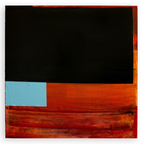
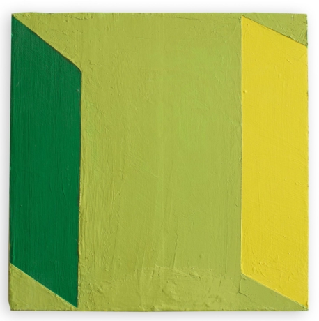
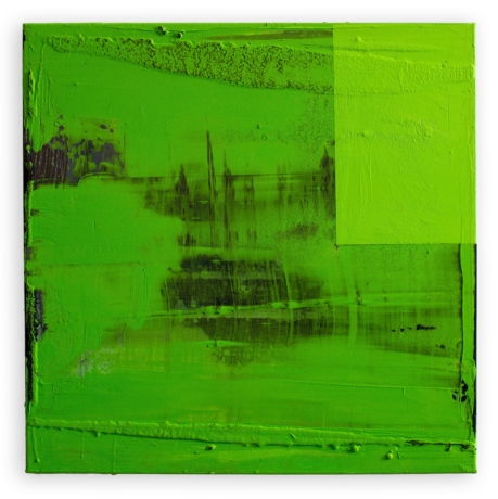
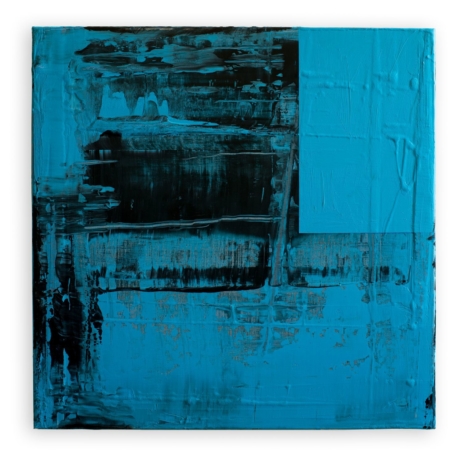
Non-objective Painting is the cultural construct I use as a vehicle to research the following topics: Incongruity, The Everyday, Fluidity, and Free Color. Through my research, I primarily take Non-Objective Painting as a mutable idea and this stance propels me into a perpetual state of inquiry fueled by a fascination with the physical properties of the material and the support. The results of this inquiry are paintings left open conceptually as they simultaneously assert themselves physically. In my personal work, I am not interested in direct declarations of personal narrative, cathartic release, social statement or the defending of tradition. I aim to create paintings that appear engagingly equivocal, which can serve as an alternative remedy to the often clichéd intent of the artist.
Incongruity: “Quirky” is a term I’ve frequently heard viewers use to describe my work. I believe what people are seeing is my interest in incongruity, which is one of the main ingredients in the human mystery we call humor. I believe with the utmost seriousness that certain facets of the painting craft should be dealt with a light touch. This take to my work which manifests in supports that eschew rectangular formatting, a scale that subverts heroic intentions, unnatural color not appropriate to a staid gallery context, seemingly errant marks given overblown prominence and gooey surface qualities that ignore common classifications of taste. I’m interested in taking the formal technique of contrast into a realm of philosophical fragmentation.
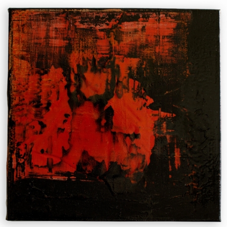
The Everyday: Historically, eastern spiritual texts emphasize an examination of one’s mundane life as a path to finding bliss, dignity and ultimately, all reality. In my work, I attempt to examine very closely what could be called the mundane materiality of the repetitious painting process. And with this approach, what is not essential to asserting the physical presence of an individual painting is taken out. The importance of the physical presence of the paintings in space is further evidenced by encouraging the viewer to look or glance at my paintings from varying angles. Because my paintings are not necessarily pictures, the traditional straight-on window into illusion view isn’t always complete. By encouraging the viewer to look more loosely, I hope to link the experience of my work with everyday viewing which doesn’t limit itself to a singular frontal view.
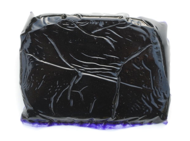
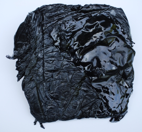
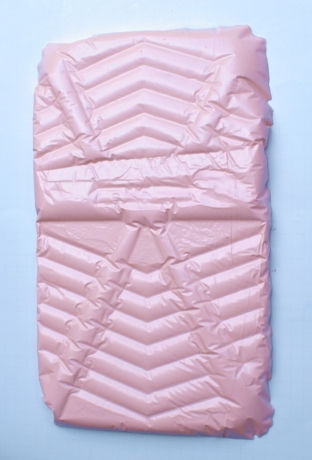
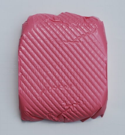
Fluidity: From a technical standpoint, all painters deal with the fluidity of the paint. However my interest in paint’s fluidity goes beyond a wet means to a dry end. This has led me to use urethane resins and pigments as well as paint. The physical properties of the resin have allowed me to engage painting in novel ways. In a recent series, my paintings were cast out of their own pigmentation, rather than being simply a flat substrate that is painted upon. The material and the support became one. The fluidity of material can mirror the fluidity of thought. I am often attempting to guide flux, where the material seeks its own level. When the paint dries or the resin cures, I want the freshness to remain. For me, the remarkable experience of seeing a 350 year old Rembrandt lies in the feeling that the paint might still be wet. If it were possible, I’d like my paint to never dry.
Free Color: Over the last century, the discourse on color as a theme of visual art has been wildly diverse, often contradictory and sometimes obscure. Color is the corporeal substance of my work with its resistance to classification the main appeal. The instability of color has been proven through theory and research, yet for me it provides an appealing foundation. In an essay on Duchamp, de Duve states, “Even when it is adequately named, color exceeds the word.” The human eye is able to discern over a million different hues yet most languages have less than twelve basic color words. Kandinsky imagined a pictorial language freed of all referential obligations, while an exterior vision changes to an interior one. My color choices are almost exclusively intuitive, the only caveat being that the color should not relate too specifically to any particular outside source. Without an obvious referent, perhaps I’m operating from a state of peculiar freedom